


By Michael Marshall, New Scientist
UPDATE: Temperatures have turned quite cool (49F) in Moscow and showers in Pakistan become more scattered as the persistent block broke down.
Raging wildfires in western Russia have reportedly doubled average daily death rates in Moscow. Diluvial rains over northern Pakistan are surging south - the UN reports that 6 million have been affected by the resulting floods.
It now seems that these two apparently disconnected events have a common cause. They are linked to the heatwave that killed more than 60 in Japan, and the end of the warm spell in western Europe. The unusual weather in the US and Canada last month also has a similar cause.
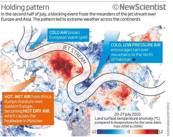
According to meteorologists monitoring the atmosphere above the northern hemisphere, unusual holding patterns in the jet stream are to blame. As a result, weather systems sat still. Temperatures rocketed and rainfall reached extremes.
Renowned for its influence on European and Asian weather, the jet stream flows between 7 and 12 kilometres above ground. In its basic form it is a current of fast-moving air that bobs north and south as it rushes around the globe from west to east. Its wave-like shape is caused by Rossby waves - powerful spinning wind currents that push the jet stream alternately north and south like a giant game of pinball.
In recent weeks, meteorologists have noticed a change in the jet stream’s normal pattern. Its waves normally shift east, dragging weather systems along with it. But in mid-July they ground to a halt, says Mike Blackburn of the University of Reading, UK (see diagram). There was a similar pattern over the US in late June.
Stationary patterns in the jet stream are called “blocking events”. They are the consequence of strong Rossby waves, which push westward against the flow of the jet stream. They are normally overpowered by the jet stream’s eastward flow, but they can match it if they get strong enough. When this happens, the jet stream’s meanders hold steady, says Blackburn, creating the perfect conditions for extreme weather.
A static jet stream freezes in place the weather systems that sit inside the peaks and troughs of its meanders. Warm air to the south of the jet stream gets sucked north into the “peaks”. The “troughs” on the other hand, draw in cold, low-pressure air from the north. Normally, these systems a constantly on the move - but not during a blocking event. See below, enlarged here.
And so it was that Pakistan fell victim to torrents of rain. The blocking event coincided with the summer monsoon, bringing down additional rain on the mountains to the north of the country. It was the final straw for the Indus’s congested river bed (see “Thirst for Indus water upped flood risk").
Similarly, as the static jet stream snaked north over Russia, it pulled in a constant stream of hot air from Africa. The resulting heatwave is responsible for extensive drought and nearly 800 wildfires at the latest count. The same effect is probably responsible for the heatwave in Japan, which killed over 60 people in late July. At the same time, the blocking event put an end to unusually warm weather in western Europe.
Blocking events are not the preserve of Europe and Asia. Back in June, a similar pattern developed over the US, allowing a high-pressure system to sit over the eastern seaboard and push up the mercury. Meanwhile, the Midwest was bombarded by air from the north, with chilly effects. Instead of moving on in a matter of days, “the pattern persisted for more than a week”, says Deke Arndt of the US National Climatic Data Center in North Carolina.
So what is the root cause of all of this? Meteorologists are unsure. Climate change models predict that rising greenhouse gas concentrations in the atmosphere will drive up the number of extreme heat events. Whether this is because greenhouse gas concentrations are linked to blocking events or because of some other mechanism entirely is impossible to say. Gerald Meehl of the National Center for Atmospheric Research in Boulder, Colorado - who has done much of this modelling himself - points out that the resolution in climate models is too low to reproduce atmospheric patterns like blocking events. So they cannot say anything about whether or not their frequency will change. ICECAP NOTE: These models are worthless on any scale or time frame.
There is some tentative evidence that the sun may be involved. Earlier this year astrophysicist Mike Lockwood of the University of Reading, UK, showed that winter blocking events were more likely to happen over Europe when solar activity is low - triggering freezing winters (New Scientist, 17 April, p 6).
Now he says he has evidence from 350 years of historical records to show that low solar activity is also associated with summer blocking events (Environmental Research Letters, in press). “There’s enough evidence to suspect that the jet stream behaviour is being modulated by the sun,” he says.
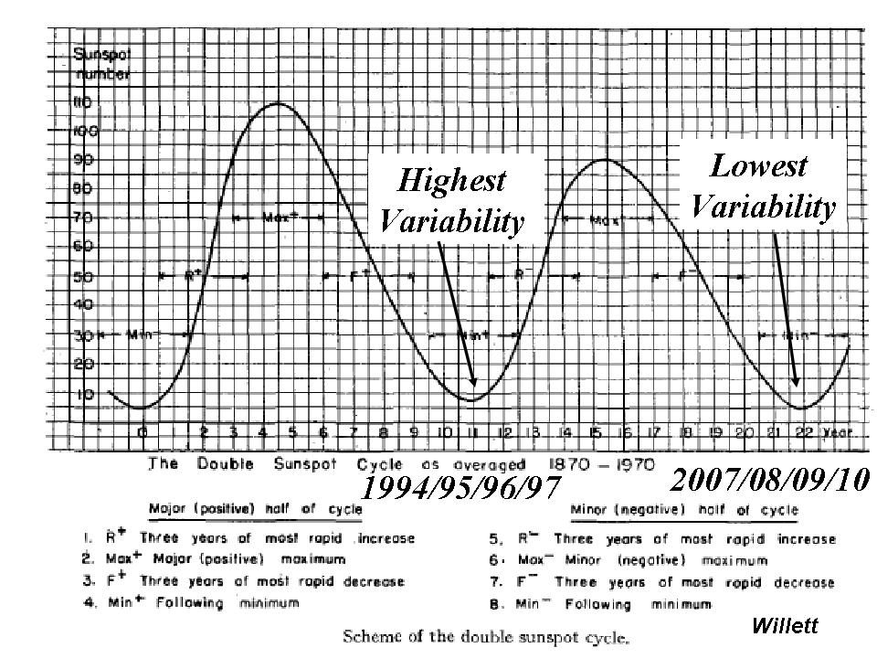
ICECAP NOTE: Hurd ‘Doc’ Willett of MIT presented at the 2nd Annual Northeast Storm Conference in 1978 a view of how the 22 year cycle affected weather patterns. His Hale Cycle work would have suggested the recent minimum 2007-2010 should be one of high “persistence” and thus low “variability”. This may have been augmented by the 106/213 year cycle concurrence. The patterns intraseasonally have been amazingly persistent since 2007. Willett passed in 1992. We are glad to see Professor Lockwood is back doing good science. See below, enlarged here.
Blackburn says that blocking events have been unusually common over the last three years, for instance, causing severe floods in the UK and heatwaves in eastern Europe in 2007. Solar activity has been low throughout.
Thirst for Indus water upped flood risk
It isn’t just heavy rain that is to blame for the current floods in Pakistan: water management has also exacerbated the risk of such events.
Both Pakistan and India depend heavily on the Indus river for their water needs. Since independence in 1947 Pakistan has virtually doubled the amount of land it irrigates with Indus water and the picture is similar for India. This thirst for water carries a heavy cost.
The Indus drains the Himalayan mountain chain and carries vast amounts of sediment. As more water is diverted into irrigation, the river flow has been severely reduced, and can’t now carry its accustomed cargo of sediment downstream. A growing number of levees and man-made channels also trap sediment on its way out to sea.
“More silt has been deposited into sand bars, reducing the capacity of the river,” says Daanish Mustafa, an expert on Indus water management at Kings College London, UK. “There is no doubt that infrastructure has exacerbated the flood risk significantly.
“Antiquated irrigation systems in Pakistan may also have made the problem worse. “Pakistan unfortunately has one of the worst irrigation efficiencies in the world,” says Uttam Sinha, a water security researcher from the Institute for Defence Studies and Analyses in New Delhi, India. Repairing the leaks and installing modern irrigation technology may help to reduce the flood risk in future. Kate Ravilious
See the New Scientist story here.
By Joseph D’Aleo
The Inspector General wrote on behalf of NOAA a response to Congressman Barton and Rohrabacher and the other committee members about the issues raised about the US climate data base (USHCN) (see attached letter and report here). They spoke with the NWS, NCDC, ATDD, several state climatologists, the AASC, the USGRP and the AMS to form their response. They examined quality control procedures, background documentation, operating procedures, budget requirements and management plans.
They examined the USHCN program to ensure that steps were taken to ensure quality control of the data. NOAA admitted to issues with siting, undocumented relocation, instrument changes, urbanization and missing data but claimed that these issues were being addressed in their new version 2 with its new ‘pal reviewed’ algorithm designed to detect “previously undisclosed inhomogenieties”.
The write up and description of the process of pal review is very amusing including an internal review, a mixed journal review with one reviewer claiming a number of issues had not been addressed. Ironicaly the reviews were apparently with one exception accidently eaten by the NOAA mascot dog and were unavailable to the Insprector General. Though there was one negative review, the Bulletin of the American Meteorological Society, not surprisingly given their advocacy goal, chose to publish it giving it ‘peer review’ status credit.
The inspector general spoke with several other individuals not directly involved in the review process and got comments from one that NOAA needed to explain the process more and a humorous claim by the chair of the Applied Climatology committee of the AMS that the developers of the new algorithm did a ‘fantastic job’ with the new algorithm.
All reviewers to their credit admitted there was a need for an improved climate data set not requiring the many adjustments made to the existing one. NOAA is requesting $100 million to implement a new national station network. This is so even though the pilot program in Alabama cost only $30,000 to implement and make operational. It’s only your tax dollars. Though they argued against what Anthony Watts, Roger Pielke Sr, I and others have claimed about the issues with their network, this is an tacit admission that these issues were real and in need of addressing (progress made).
THE VERSION 2 ALGORITHM
Despite intimation that the algorithm corrects for all the deficiencies ADMITTED by NOAA, the new algorithm really only address 2 well. It is a change point algorithm looking for discontinuities that would indicate previously undocumented station moves/land use change or instrument changes. It is not clear how many of these issues among the 1221 stations in the network were uncovered with the new algorithm.
Here is an enlarged version of the example (courtesy of Anthony Watts surface station.org effort) of a land use change that the new algorithms ‘should’ have caught.
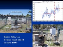
Here a tennis court was built around a station in Tahoe City CA. The enclosure around the Stevenson shelter, housing the sensor included a trash burn barrel within 5 feet. The data plot for Tahoe City reflected the change made around 1980.
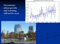
What is left uncovered and unaddressed are far worse issues, urbanization and bad siting. The new algorithms would never catch the following slow ramp up of temperatures you find in most cities and towns as they grow (as in Sacramento below, enlarged here. Oke (1973) noted that even small towns can develop a significant urban warm bias (population of just 1000 - 2C).
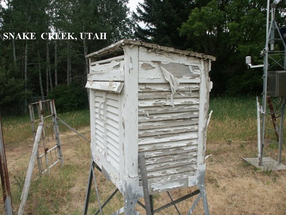
Nor would the new algorithm catch the slow degradation of siting as trees grow up and pavement, buildings or other heat sources slowly encroach around a station or the shelter is not properly maintained as in the Snake Creek, Utah one below enlarged here.

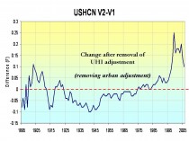
In actual fact version 2 took a step backwards by removing a previous urbanization adjustment. Far more stations both urban areas and even small to moderate size towns exhibited growth and many airports saw growth of the city around them. This introduced a warming trend in what had been a cooling linear trend since 1940 and about which even James Hansen admitted in 1999:
“The U.S. has warmed during the past century, but the warming hardly exceeds year-to-year variability. Indeed, in the U.S. the warmest decade was the 1930s and the warmest year was 1934.”
The temperature plot at that time in USHCN version 1 looked like this (enlarged here) with the recent warming significantly less than that around 1940.
After removing the urban adjustment in 2007, the US plot looked like this (enlarged here.
The difference in the two is shown below (enlarged here):
This change introduced a cooling of the previous warm period from the 1910s to 1940s and a warming post 1985 but especially after 2000.
IS THE URBAN ADJUSTMENT REALLY NECESSARY?
Literally dozens of papers have documented it is. See our paper on Surface Temperature Records: A Policy Driven Deception for a lengthy discussion of it and of the siting issue which despite NCDC’s claims is not properly addressed for in the version 2. Almost every night your local television broadcaster will make a forecast like ‘lows tonight in town near 60 but down in the upper 40s the colder (more rural) spots.’
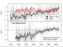
NOAA uses a paper by their own Tom Peterson who played statistical games with a data set and claimed it showed an urban adjustment was no longer needed.
Steve McIntyre challenged NOAA’s Peterson (2003), who had said, “Contrary to generally accepted wisdom, no statistically significant impact of urbanization could be found in annual temperatures” by showing that the difference between urban and rural temperatures for Peterson’s own 2003 station set was 0.7C and between temperatures in large cities and rural areas 2C (below, enlarged here).
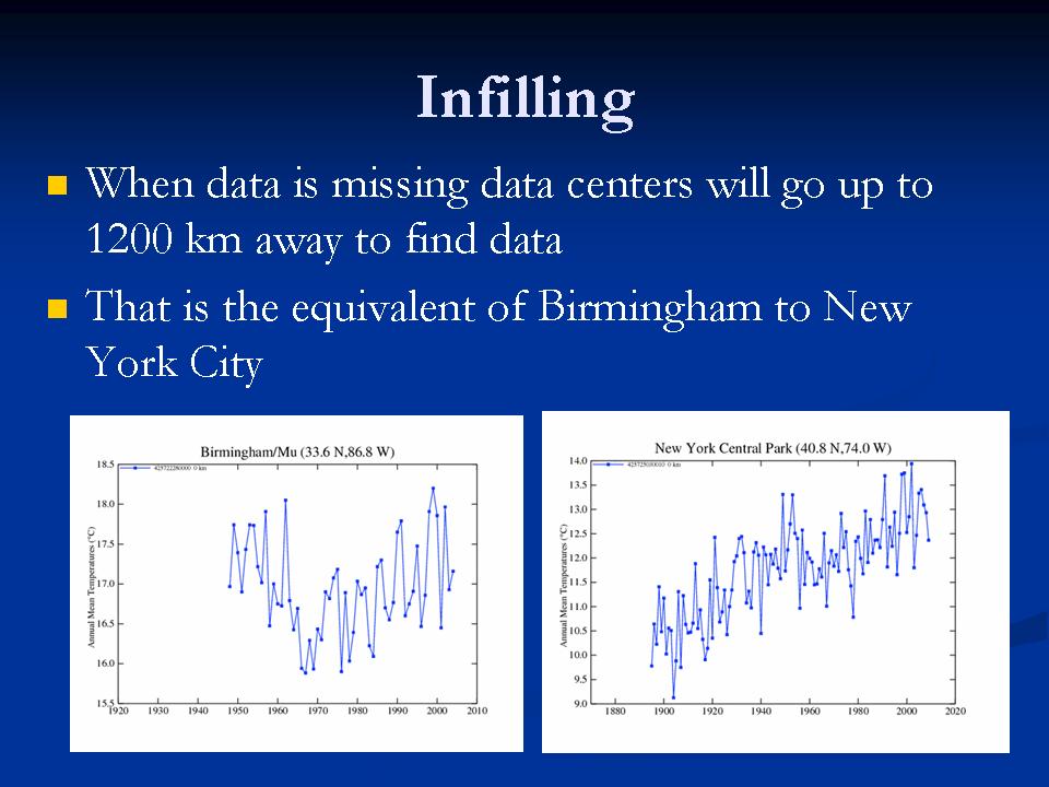
Despite the new algorithm which might catch a few station moves or changes that previously went undocumented, NOAA’s USHCN remains seriously flawed. In fact it is likely WORSE than it was a decade ago when it adjusted for urbanization. Ironically their global data set GHCN is even less trustworthy because it has huge holes in and much more missing monthly data requiring infilling, a process that may require using data from 1200km away to estimate the missing data (the equivalent of using New York City to fill in for missing months in Birmingham, Alabama) (below, enlarged here).

More to come. See PDF here.
By Paul Driessen
If 10% ethanol in gasoline is good, 15% (E15) will be even better. At least for some folks.
We’re certainly heading in that direction - thanks to animosity toward oil, natural gas and coal, fear-mongering about global warming, and superlative lobbying for “alternative,” “affordable,” “eco-friendly” biofuels. Whether the trend continues, and what unintended consequences will be unleashed, will depend on Corn Belt versus consumer politics and whether more people recognize the downsides of ethanol.
Federal laws currently require that fuel suppliers blend more and more ethanol into gasoline, until the annual total rises from 9 billion gallons of EtOH in 2008 to 36 billion in 2022. The national Renewable Fuel Standard (RFS) also mandates that corn-based ethanol tops out at 15 billion gallons a year, and the rest comes from “advanced biofuels” - fuels produced from switchgrass, forest products and other non-corn feedstocks, and having 50% lower lifecycle greenhouse gas emissions than petroleum.
These “advanced biofuels” thus far exist only on paper or in laboratories and demonstration projects. But Congress apparently believes passing a law will turn wishes into horses and mandates into reality. Create the demand, say ethanol activists, and the supply will follow. In plain-spoken English: Impose the mandates and provide sufficient subsidies, and ethanol producers will gladly “earn” billions growing crops, building facilities and distilling fuel.
Thus, ADM, Cargill, POET bio-energy and the Growth Energy coalition will benefit from RFS and other mandates, loan guarantees, tax credits and direct subsidies. Automobile and other manufacturers will sell new lines of vehicles and equipment to replace soon-to-be-obsolete models that cannot handle E15 blends. Lawmakers who nourish the arrangement will continue receiving hefty campaign contributions from Big Farma.
However, voter anger over subsidies and deficits bode ill for the status quo. So POET doubled its Capital Hill lobbying budget in 2010, and the ethanol industry has launched a full-court press to have the Senate, Congress and Environmental Protection Agency raise the ethanol-in-gasoline limit to 15% ASAP. As their anxiety levels have risen, some lobbyists are suggesting a compromise at 12% (E12).
Not surprisingly, ethanol activism is resisted by people on the other side of the ledger - those who will pay the tab, and those who worry about the environmental impacts of ethanol production and use.
* Taxpayer and free market advocates point to the billions being transferred from one class of citizens to another, while legislators and regulators lock up billions of barrels of oil, trillions of cubic feet of natural gas, and vast additional energy resources in onshore and offshore America. They note that ethanol costs 3.5 times as much as gasoline to produce, but contains only 65% as much energy per gallon as gasoline.
* Motorists, boaters, snowmobilers and outdoor power equipment users worry about safety and cost. The more ethanol there is in gasoline, the more often consumers have to fill up their tanks, the less value they get, and the more they must deal with repairs, replacements, lost earnings and productivity, and malfunctions that are inconvenient or even dangerous.
Ethanol burns hotter than gasoline. It collects water and corrodes plastic, rubber and soft metal parts. Older engines and systems may not be able to handle E15 or even E12, which could also increase emissions and adversely affect engine, fuel pump and sensor durability.
Home owners, landscapers and yard care workers who use 200 million lawn mowers, chainsaws, trimmers, blowers and other outdoor power gear want proof that parts won’t deteriorate and equipment won’t stall out, start inadvertently or catch fire. Drivers want proof that their car or motorcycle won’t conk out on congested highways or in the middle of nowhere, boat engines won’t die miles from land or in the face of a storm, and snowmobiles won’t sputter to a stop in some frigid wilderness.
All these people have a simple request: test E12 and E15 blends first. Wait until the Department of Energy and private sector assess these risks sufficiently, and issue a clean bill of health, before imposing new fuel standards. Safety first. Working stiff livelihoods second. Bigger profits for Big Farma and Mega Ethanol can wait. Some unexpected parties recently offered their support for more testing.
Representatives Henry Waxman (D-CA), Ed Markey (D-MA), Joe Barton (R-TX) and Fred Upton (R-MI) wrote to EPA Administrator Lisa Jackson, advising her that “Allowing the sale of renewable fuel… that damages equipment, shortens its life or requires costly repairs will likely cause a backlash against renewable fuels. It could also seriously undermine the agency’’s credibility in addressing engine fuel and engine issues in the future.”
* Corn growers will benefit from a higher ethanol RFS. However, government mandates mean higher prices for corn - and other grains, as corn and switchgrass incentives reduce farmland planted in wheat or rye. Thus, beef, pork, poultry and egg producers must pay more for corn-based feed; grocery manufacturers face higher prices for grains, eggs, meat and corn syrup; and folks who simply like affordable food cringe as their grocery bills go higher.
* Whether the issue is food, vehicles or equipment, blue collar, minority, elderly and middle class families would be disproportionately affected, Affordable Power Alliance co-chairman Harry Jackson, Jr. points out. They have to pay a larger portion of their smaller incomes for food, and own older cars and power equipment that would be particularly vulnerable to E15 fuels.
* Ethanol mandates also drive up the cost of food aid - so fewer malnourished, destitute people can be fed via USAID and World Food Organization programs.
Biotechnology will certainly help, by enabling farmers to produce more biofuel crops per acre, using fewer pesticides and utilizing no-till methods that reduce soil erosion, even under drought conditions. If only Greenpeace and other radical groups would cease battling this technology. However, there are legitimate environmental concerns.
* Oil, gas, coal and uranium extraction produces large quantities of high-density fuel for vehicles, equipment and power plants (to recharge batteries) from relatively small tracts of land. We could produce 670 billion gallons of oil from Arctic land equal to 1/20 of Washington, DC, if ANWR weren’t off limits.
By contrast, 15 billion gallons of corn-based ethanol requires cropland and wildlife habitat the size of Georgia, and for 21 billion gallons of advanced biofuel we’d need South Carolina planted in switchgrass.
* Ethanol has only two-thirds the energy value of gasoline ‘ and it takes 70% more energy to grow and harvest corn and turn it into EtOH than what it yields as a fuel. There is a “net energy loss,” says Cornell University agriculture professor David Pimental.
* Pimental and other analysts also calculate that growing and processing corn into ethanol requires over 8,000 gallons of water per gallon of alcohol fuel. Much of the water comes from already stressed aquifers - and growing the crops results in significant pesticide, herbicide and fertilizer runoff.
* Ethanol blends do little to reduce smog, and in fact result in more pollutants evaporating from gas tanks, says the National Academy of Sciences. As to preventing climate change, thousands of scientists doubt the human role, climate “crisis” claims and efficacy of biofuels in addressing the speculative problem.
Meanwhile, Congress remains intent on mandating low-water toilets and washing machines, and steadily expanding ethanol diktats. And EPA wants to crack down on dust from livestock, combine operations and tractors in farm fields.
“With Congress,” Will Rogers observed, “every time they make a joke it’s a law, and every time they make a law it’s a joke.” If it had been around in 1934, he would have added EPA. Let’s hope for some change. (PDF)
Paul Driessen is senior policy advisor for the Committee For A Constructive Tomorrow and Congress of Racial Equality, and author of Eco-Imperialism: Green power - Black death.
By Paul MacRae, August 5, 2010
The recent report by the National Oceanic and Atmospheric Administration shows that surface temperatures have increased in the past decade. In fact, the NOAA report, “State of the Climate in 2009,” says 2000-2009 was 0.2 Fahrenheit (0.11 Celsius) warmer than the decade previous. The press release was so splashy it made the front page of Toronto’s Globe and Mail with the headline: “Signs of warming earth ‘unmistakable’”.
Of course, given that the planet is in an interglacial period, we would expect “unmistakable” signs of warming, including melting glaciers and Arctic ice, rising temperatures, and rising sea levels. That’s what the planet does during an interglacial.
Furthermore, we’re nowhere near the peak reached by the interglacial of 125,000 years ago, when temperatures were 1-3C higher than today and sea levels up to 20 feet higher, according to the Intergovernmental Panel on Climate Change itself. In other words, the Globe might as well have had a headline reading “Signs of changing weather ‘unmistakable’.”
Similarly, the NOAA report laments: “People have spent thousands of years building society for one climate and now a new one is being created - one that’s warmer and more extreme.” The implication is that we can somehow freeze-dry the climate we’ve got to last forever, which is absurd.
Sea levels have risen 400 feet in the past 15,000 years, causing all kinds of inconvenience for humanity in the process-and all quite naturally. As the interglacial continues, sea levels will rise and temperatures will increase-until the interglacial reaches its peak, at which point the planet will again move toward glacial conditions. To think that we can somehow stop this process is insane.
Even die-hard alarmists admitted 2000-2009 cooling
But what about the NOAA claim that the surface temperature increased .11C during 2000-2009? Although they did everything possible to hide this information from the public, media, politicians, and even fellow scientists, by the late 2000s even die-hard alarmists were eventually forced to accept that the surface temperature record showed no warming as of the late 1990s, and some cooling as of about 2002. In other words, overall, for the first decade of the 21st century, there was no warming and even some cooling.
One of the consistent themes in the Climategate emails was consternation that the planet wasn’t warming as expected by the models (that is, about 0.2C per decade). For example, as early as 2005 the then head of the Climatic Research Unit (CRU), Phil Jones, wrote in an email: “The scientific community would come down on me in no uncertain terms if I said the world had cooled from 1998. OK it has but it is only seven years of data and it isn’t statistically significant.”
Fellow Climategate emailer and IPCC contributor Kevin Trenberth wrote to hockey-stick creator Michael Mann in 2009: “The fact is that we cannot account for the lack of warming at the moment and it’s a travesty that we can’t.” Note the date: 2009, the last year of the decade. As far as Trenberth knew-and he should have known as a leading IPCC author-the planet hadn’t warmed for several years up to that time.
Even Tim Flannery, author of the arch-alarmist The Weather Makers, acknowledged in November 2009: “In the last few years, where there hasn’t been a continuation of that warming trend, we don’t understand all of the factors that creates Earth’s climate, so there are some things we don’t understand, that’s what the scientists were emailing about. These people [the scientists] work with models, computer modeling. When the computer modeling and the real world data disagree you have a problem.”
Jones tries for climate honesty
Yes, you do have a problem, to the point where, in February 2010, after he’d been suspended as head of the CRU following the Climategate scandal, and in an attempt to restore his reputation as an honest scientist, Jones came a bit clean in an interview with the BBC. For example, Jones agreed with the BBC interviewer that there had been “no statistically significant warming” since 1995 (although he asserted that the warming was close to significant), whereas in his 2005 email he was at pains to hide the lack of warming from the public and even fellow researchers.
Jones admitted that from 2002-2009 the planet had been cooling slightly (-0.12C per decade), although he contended that “this trend is not statistically significant.” In short, as far as Jones knew in February 2010-and as the keeper of the Hadley-CRU surface temperature record he was surely in a very good position to know-the planet hadn’t warmed on average over the decade.
In the BBC interview, Jones calculated the overall surface temperature trend for 1975 to 2009 to be +0.16C per decade. Since that includes the warming years 1975-1998, it seems incredible that NOAA could manufacture a warming of 0.11C for 2000-2009, as shown in this graph from the 2009 NOAA report, page 5.
To show this level of warming, NOAA must have included lead-up to the January-March 2010 El Nino. A surge in warming at the end of the decade would tend to pull the 2000-2009 average up, but this doesn’t negate the fact that for almost all of the last decade, the planet did not warm.
(Note that the temperature is in Fahrenheit degrees. This caused much confusion in Canadian newspapers, including the Globe and Mail, the National Post, and most newspapers on the National Post’s Postmedia news network. All reported the increase as 0.2 Celsius rather than Fahrenheit, thereby doubling the already dubious warming claimed by NOAA. On Monday, Aug. 1, I sent letters to the Globe, National Post and Victoria Times Colonist pointing out this factual error. None of these newspapers has printed either the letter or a correction.)
NOAA’s U.S. temperatures contradict 2009 report
Curiously, another part of the NOAA website directly contradicts the NOAA report. On its site, NOAA offers a gadget that lets browsers check the temperature trend in the continental United States for any two years between 1895 and 2010. Here’s what the graph shows for the years 2000-2009 in the United States:
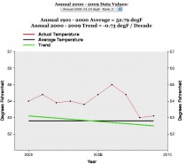
This graph shows a temperature decline of 0.73Fahrenheit (-0.4C) for 2000-2009 in the U.S. To get a perspective on how large a decline this is: the IPCC estimates that the temperature increase for the whole of the 20th century was 1.1F, or 0.6C. In other words, at least in the United States, the past decade’s cooling wiped out two-thirds of the temperature gain of the last century.
While the U.S. isn’t, of course, the whole world, it has the world’s best temperature records, and a review of the NOAA data since 1895 shows that in the 20th century the U.S. temperature trends mirrored, quite closely, the global temperature trends. So, for example, between 1940-1975, a global cooling period, the NOAA chart showed a temperature decline of 0.14F (-0.07C).
In other words, it stretches credulity to the breaking point to believe that the global temperature trend from 2000-2009 could be a full 0.51C - half a degree Celsius - higher than the temperature trend for the United States (that is, -.4C + .11C).
Until NOAA issues a correction (which isn’t likely), the cooling of the past decade - which has been such an embarrassment to the hypothesis that human-caused carbon emissions will cause runaway warming - is gone, conjured away by a wave of the NOAA climate fairy’s magic wand.
See compilation of scientist responses to NOAA’s report by SPPI here.
Icecap Note: the warm spring and hot summer for a lot of places is characteristic of a La Nina summer post an El Nino winter. Best example may be 1988. This was used by many forecasters to warn of a hot summer. The same hypocritical alarmists touting the extreme summer heat in places (one of the coldest summers in a century in the west), told us to ignore the coldest winters in decades and in places ever in the Northern Hemisphere last winter as that was weather not climate.
See a collection of respponses back to NOAA’s recent claims on SPPI here.
.
By Dr. Ross McKitrick
Summary
There are three main global temperature histories: the combined CRU-Hadley record (HADCRU), the NASA-GISS (GISTEMP) record, and the NOAA record. All three global averages depend on the same underlying land data archive, the Global Historical Climatology Network (GHCN). CRU and GISS supplement it with a small amount of additional data.
Because of this reliance on GHCN, its quality deficiencies will constrain the quality of all derived products. The number of weather stations providing data to GHCN plunged in 1990 and again in 2005. The sample size has fallen by over 75% from its peak in the early 1970s, and is now smaller than at any time since 1919. The collapse in sample size has not been spatially uniform. It has increased the relative fraction of data coming from airports to about 50 percent (up from about 30 percent in the 1970s). It has also reduced the average latitude of source data and removed relatively more high-altitude monitoring sites.
GHCN applies adjustments to try and correct for sampling discontinuities. These have tended to increase the warming trend over the 20th century. After 1990 the magnitude of the adjustments (positive and negative) gets implausibly large.
CRU has stated that about 98 percent of its input data are from GHCN. GISS also relies on GHCN with some additional US data from the USHCN network, and some additional Antarctic data sources. NOAA relies entirely on the GHCN network.
Oceanic data are based on sea surface temperature (SST) rather than marine air temperature (MAT). All three global products rely on SST series derived from the ICOADS archive, though the Hadley Centre switched to a real time network source after 1998, which may have caused a jump in that series. ICOADS observations were primarily obtained from ships that voluntarily monitored SST. Prior to the post-war era, coverage of the southern oceans and polar regions was very thin. Coverage has improved partly due to deployment of buoys, as well as use of satellites to support extrapolation. Ship-based readings changed over the 20th century from bucket-and-thermometer to engine-intake methods, leading to a warm bias as the new readings displaced the old. Until recently it was assumed that bucket methods disappeared after 1941, but this is now believed not to be the case, which may necessitate a major revision to the 20th century ocean record. Adjustments for equipment changes, trends in ship height, etc., have been large and are subject to continuing uncertainties. Relatively few studies have compared SST and MAT in places where both are available. There is evidence that SST trends overstate nearby MAT trends.
Processing methods to create global averages differ slightly among different groups, but they do not seem to make major differences, given the choice of input data. After 1980 the SST products have not trended upwards as much as land air temperature averages. The quality of data over land, namely the raw temperature data in GHCN, depends on the validity of adjustments for known problems due to urbanization and land-use change. The adequacy of these adjustments has been tested in three different ways, with two of the three finding evidence that they do not suffice to remove warming biases.
The overall conclusion of this report is that there are serious quality problems in the surface temperature data sets that call into question whether the global temperature history, especially over land, can be considered both continuous and precise. Users should be aware of these limitations, especially in policy sensitive applications.
See full report here.
Ross also notes the following on another paper:
You might be interested in a new paper I have coauthored with Steve McIntyre and Chad Herman, in press at Atmospheric Science Letters, which presents two methods developed in econometrics for testing trend equivalence between data sets and then applies them to a comparison of model projections and observations over the 1979-2009 interval in the tropical troposphere. One method is a panel regression with a heavily parameterized error covariance matrix, and the other uses a non-parametric covariance matrix from multivariate trend regressions. The former has the convenience that it is coded in standard software packages but is restrictive in handling higher-order autocorrelations, whereas the latter is robust to any form of autocorrelation but requires some special coding. I think both methods could find wide application in climatology questions.
The tropical troposphere issue is important because that is where climate models project a large, rapid response to greenhouse gas emissions. The 2006 CCSP report pointed to the lack of observed warming there as a “potentially serious inconsistency” between models and observations. The Douglass et al. and Santer et al. papers came to opposite conclusions about whether the discrepancy was statistically significant or not. We discuss methodological weaknesses in both papers. We also updated the data to 2009, whereas the earlier papers focused on data ending around 2000.
We find that the model trends are 2x larger than observations in the lower troposphere and 4x larger than in the mid-troposphere, and the trend differences at both layers are statistically significant (p<1%), suggestive of an inconsistency between models and observations. We also find the observed LT trend significant but not the MT trend.
If interested, you can access the pre-print, SI and data/code archive at my new weebly page.
See how these agree with many of the findings and conclusions in the compendium Surface Temperature Records: A Policy Driven Deception by Anthony Watts, E.M. Smith and I (and many others). See also further work on GHCN unedited here by E.M. Smith (Chiefio).
Investors Business Daily
Taxes: While the oil and gas companies are bearing the brunt of taxation, regulation and environmental angst, others are doing just fine, thank you. If you think cap-and-trade is dead, just follow the money.
According to a recently released Center for Responsive Politics review of reports filed with the U.S. Senate and U.S. House, General Electric and its subsidiaries spent more than $9.5 million on federal lobbying from April to June - the most it’s spent on lobbying since President Obama has been in office.
Why? As the fight over cap-and-trade grows, so does lobbying. Since January, GE and its units have spent more than $17.6 million on lobbying - a jump of 50% over the first six months of 2009.
GE is just one of many organizations and individuals that stand to make money if cap-and-trade makes it through Congress. GE makes wind turbines, not oil rigs, and has a vested interest in shutting down its fossil fuel competitors.
In an Aug. 19, 2009 e-mail obtained by Steve Milloy of JunkScience.com, General Electric Vice Chairman John Rice called on his GE co-workers to join the General Electric Political Action Committee “to collectively help support candidates who share the values and goals of GE.”
And what are those goals, and just what has GEPAC accomplished thus far? “On climate change,” Rice wrote, “we were able to work closely with key authors of the Waxman-Markey climate and energy bill, recently passed by the House of Representatives. If this bill is enacted into law, it will benefit many GE businesses.”
GE is a member of the U.S. Climate Action Partnership, which advocates cap-and-trade legislation and leads the drive for reductions of so-called greenhouse gases. One of its subsidiaries was involved in Hopenhagen, a campaign by a group of businesses to build support for the recent Copenhagen Climate Conference, which was supposed to come up with a successor to the failed Kyoto Accords.
To be fair, coal and gas companies lobby too, both out of self-preservation and self-interest.
But they produce a useful product that creates jobs and boosts GDP. Alternative energy, even after huge subsidies, adds little to our energy mix. Evidence suggests alternative energy is a net job loser, siphoning resources from productive areas of the economy.
Renewable energy sources like wind, solar energy and biomass total only 3% of our energy mix. Spain’s experience is that for each “green” job created, 2.2 jobs are lost due to the siphoning off of resources that private industry needed to grow.
There’s money to be made in climate change even if the climate doesn’t change, and the profit motive may now be the main driver of cap-and-trade.
The Chicago Climate Exchange (CCX) was formed to buy and sell carbon credits, the currency of cap-and-trade. Founder Richard Sandor estimates the climate trading market could be “a $10 trillion dollar market.”
It could very well be if cap-and-trade legislation like Waxman-Markey and Kerry-Boxer are signed into law, making energy prices necessarily skyrocket, and as companies buy and trade permits to emit those six “greenhouse” gases.
As we have written, profiteering off climate change hysteria is a growth industry as well as a means to the end goal of fundamentally transforming America, as the President has said was his goal.
Czech President Vaclav Klaus has called climate change a religion whose zealots seek the establishment of government control over the means of production. It reminds him, he said, of the totalitarianism he once endured.
After the Climate-gate scandal broke, Lord Christopher Monckton, a former science adviser to British Prime Minister Margaret Thatcher, said of the scientists at Britain’s Climate Research Unit at the University of East Anglia and those they worked with: “They’re criminals.” He also called them “huckstering snake-oil salesmen and ‘global warming’ profiteers.”
Like the scientists who lived off the grant money they received from scaring us to death with manipulated data, others hope to profit off perhaps the greatest scam of all time. See this important post here.
Global Temperature And Data Distortions ContinueBy Dr. Tim Ball
Recent reports claim June was the warmest on record, but it seems to fly in the face of reports of record cold from around the world.
Reports from Australia say, “Sydney recorded its coldest June morning today since 1949, with temperatures diving to 4.3 degrees just before 6:00 a.m. (AEST).” “Experts say it is unusual to see such widespread cold weather in June.”
In the southern hemisphere reports of cold have appeared frequently but rarely make the mainstream media. “The Peruvian government has declared a state of emergency in more than half the country due to cold weather.” “This week Peru’s capital, Lima, recorded its lowest temperatures in 46 years at 8C, and the emergency measures apply to several of its outlying districts.”
“In Peru’s hot and humid Amazon region, temperatures dropped as low as 9C. The jungle region has recorded five cold spells this year. Hundreds of people - nearly half of them very young children - have died of cold-related diseases, such as pneumonia, in Peru’s mountainous south where temperatures can plummet at night to -20C.” “A brutal and historical cold snap has so far caused 80 deaths in South America, according to international news agencies. Temperatures have been much below normal for over a week in vast areas of the continent.”
“It snowed in nearly all the provinces of Argentina, an extremely rare event. It snowed even in the western part of the province of Buenos Aires and Southern Santa Fe, in cities at sea level.” (Source)
Evidence of the cold is reflected in the fact that Antarctic ice is continuing to reach record levels. “Antarctic sea ice peaks at third highest in the satellite record”.
The same contradictory evidence is happening in the Arctic. They claimed the most dramatic warming was occurring in the Arctic but this contradicts what the ice is doing. Ice continues its normal melt of the summer with a slowing rate slowed in the months of June and July. (Figure 1). The red line is for 2010.
So where are the stories coming from? It goes back to the manipulation of temperature data by the two main generators the Goddard Institute of Space Studies (GISS) and the Hadley Climate Research Unit (HadCrut). They use data provided by individual countries of the World Meteorological Organization. This is supposedly raw data, but in fact it has already been adjusted for various presumed local anomalies.
But the arctic warming is even more problematic. The Arctic Climate Impact Assessment (ACIA) is the source of data for Intergovernmental Panel on Climate Change yet it tells us there is no data for the entire Arctic Ocean Basin. Figure 2 shows the diagram from their report.
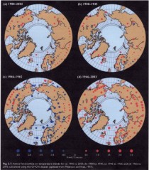
Figure 2: Weather stations for the Arctic.
Source: Arctic Climate Impact Assessment Report
This is why the map showing temperature for the Arctic shows “No data” for the region (Figure 3).
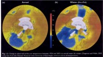
Figure 3: Temperatures for the period 1954 to 2003. They give the source as the CRU. Source: Arctic Climate Impact Assessment Report
So how do they determine that the Arctic is warming at all, let alone more rapidly than other regions? The answer is, with GISS at least, they use computer models to extrapolate. They do this by assuming that a weather station record is valid for a 1200 km region. Figure 4 shows the 1200 km smoothing results for the Arctic region (The green circle is 80N latitude.) showing the interpolation of southern weather stations to Arctic. Source: wattsupwiththat.com
Then we see what happens when the interpolation or smoothing is done using a more reasonable 250 km (Figure 5). Temperature pattern using a 250 km range for single station data. Source: wattsupwiththat.com
None of this is surprising because GISS have consistently distorted the record always to amplify warming. The problem of data adjustment is best illustrated by comparing the results of GISS and Hadcrut (Figure 6).
Figure 6: Comparison of Global temperature record. Source: Steve Goddard, WUWT.
The Hadcrut data shows what Phil Jones, former Director of the Climatic Research Unit (CRU) confirmed to the BBC that global temperatures have not increased since 1998. However, the GISS data shows a slight warming over the period and a significant increase from 2007. How can two records both using the same weather data achieve such different conclusions? The simple answer is they use different stations and adjust them differently, especially for such things as the Urban Heat Island Effect (UHIE).
There is another problem.
The number of stations used to produce a global average was significantly reduced in 1990 and this affected temperature estimates as Ross McKitrick showed (Figure 7). He wrote, “The temperature average in the above graph is unprocessed. Graphs of the ‘Global Temperature’ from places like GISS and CRU reflect attempts to correct for, among other things, the loss of stations within grid cells, so they don’t show the same jump at 1990.” McKitrick got the idea for the problem from an article by meteorologist Joe D’Aleo (2002).
The challenge is to produce meaningful long-term records from such interrupted data, but that is not the only problem because the loss of stations is not uniform. “The loss in stations was not uniform around the world. Most stations were lost in the former Soviet Union, China, Africa and South America."This is may explain the distortions currently occurring because it adds to the distortions that already exist toward eastern North American and western European stations. The pattern of temperatures of the Northern Hemisphere in the early spring and summer saw heat in eastern North America and Western Europe. There is a greater density of weather stations in these regions and they have the greatest heat island effect. The rest of the Northern Hemisphere and the Southern Hemisphere had cooler conditions but in the deliberately distorted record this was minimized.
McKitrick, Essex and Andersen, in “Does a global temperature exist?"concluded, “he purpose of this paper was to explain the fundamental meaninglessness of so-called global temperature data.” “But nature is not obliged to respect our statistical conventions and conceptual shortcuts.”
That is clearly the case this year and it confirms Alfred Whitehead’s observation that, “There is no more common error than to assume that, because prolonged and accurate calculations have been made, the application of the result to some fact of nature is absolutely certain”.
Read and see more here.
By Dennis Ambler
As we are told of yet another “hottest year on record”, our daily news reports are full of “hot testimony”, for example the heat wave in Moscow, Russia is described in this report:
“The heat has caused asphalt to melt, boosted sales of air conditioners, ventilators, ice cream and beverages, and pushed grain prices up. Environmentalists are blaming the abnormally dry spell on climate change.
On ‘black’ Saturday, temperatures in Moscow hit a record high of 38 degrees Celsius with little relief at night, making this July the hottest month in 130 years. The average temperature in central Russia is 9 degrees above the seasonal norm.”
As usual, WWF regard this as proof of global warming,
“Certainly, such a long period of hot weather in unusual for central Russia. But the global tendency proves that in future, such climate abnormalities will become only more frequent”, says Alexey Kokorin, the Head of Climate and Energy Program of the World Wide Fund (WWF) Russia.
He fails, of course, to say what caused the previous heat wave of similar magnitude 130 years previously, as was mentioned in the report. Such is the nature of environmental reporting these days, that such questions equally do not arise in the minds of those willing reporters who swallow every crumb of global warming thrown to them. Never ever mentioned are historical instances such as the seven month long European heat wave of 1540, when the River Rhine dried up and the bed of the River Seine in Paris was used as a thoroughfare.
It seems to be axiomatic, that whilst reports such as the Moscow Heat wave make the headlines, there is scant reporting in the popular media of the severe cold in the South American winter, with loss of life and livelihoods, due to temperatures in some places reaching minus 15 celsius, or 5 deg F.
“The polar wave that has trapped the Southern Cone of South America has caused an estimated one hundred deaths and killed thousands of cattle, according to the latest reports on Monday from Argentina, south of Brazil, Uruguay, Paraguay, Chile and Bolivia.
Even the east of the country which is mostly sub-tropical climate has been exposed to frosts and almost zero freezing temperatures.”
But not to worry, it is still global warming, as explained by the Moscow head of WWF:
“I think that the heat we are suffering from now as well as very low temperatures we had this winter, are hydro-meteorological tendencies that are equally harmful for us as they both were caused by human impact on weather and the greenhouse effect which has grown steadily for the past 30-40 years.”
The “cold is hot” approach can be traced back to a working document by the UK Tyndall Centre for Climate Change back in 2004, when they said:
* Only the experience of positive temperature anomalies will be registered as indication of change, if the issue is framed as global warming.
* Both positive and negative temperature anomalies will be registered in experience as indication of change if the issue is framed as climate change.
* We propose that in those countries where climate change has become the predominant popular term for the phenomenon, unseasonably cold temperatures, for example, are also interpreted to reflect climate change/global warming.
It certainly works for WWF and the mainstream media, although surprisingly, the UK Guardian did a slight volte face when it changed a headline from:
“2010 on track to become warmest year ever” to the slightly less dramatic “2010 could be among warmest years recorded by man”
Since, by decree of James Hansen, there were no reliable thermometers prior to 1880, this is a pretty short record in the overall scheme of things. However the UK Central England Temperature Record goes back to 1659, when the “non-existent” Little Ice Age was producing extremely low temperatures, with winter averages barely above zero deg C.
A Press Release from 1698 could have said for example:
1698 - “Eight of the coldest years have occurred in the last 15 years”
An enterprising environmental journalist of the time could then have totally forgotten that period, and produced this headline, as temperatures recovered:
1733 - The UK has heated by a massive 3.2 degrees over the last 4 decades,
There are many more temperature periods where such specious claims can be made, if the right starting and ending points are selected and of course they are all meaningless, as are the current headlines. In fact the Central England temperature average for the thirty year period 1971-2000, was just 0.51 deg C higher than the thirty year period 1701-1730, some 270 years earlier. If you consider the impact of urban heat islands on the temperature record since that time, you can only ask, “what global warming”?
The average Central England summer average for 1961-90, the baseline period used by CRU, is actually -0.15 deg C lower than the summer average for 1721-1750, and under current definitions, thirty years counts as climate, but don’t tell anyone, it might spoil the story.
See story on SPPI here.
While heat keeps returning to the mid-Atlantic where last winter all-time record snows fell, nothing but cool weather has plagued the west coast. (May 1 to July 27, 2010 anomalies are shown below, enlarged here).
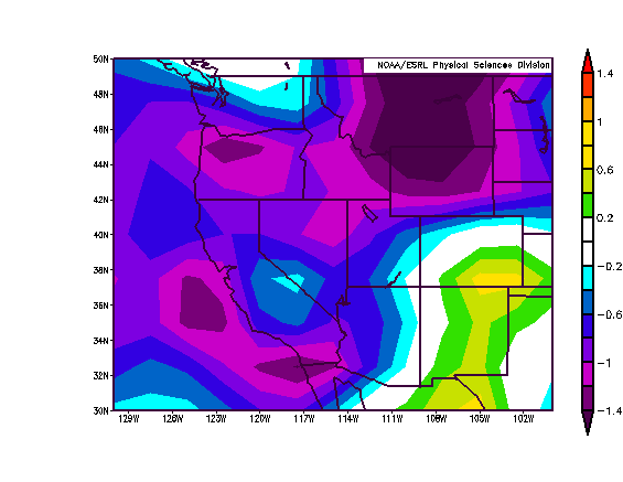
San Diego’s coldest July in 99 years coming to end
San Diego Union Tribune
San Diego hasn’t had a July that’s been this chilly since 1911, the year Chevrolet entered the car market and a pilot named Calbraith Rodgers made the first coast-to-coast flight. At least, that’s how it appears things will turn out. The average monthly temperature at Lindbergh Field stands at 65.9 degrees, almost five degrees below normal, says the National Weather Service. Forecasters say that the marine layer will prevent the airport’s temperatures from rising above the upper 60s today and that the monthly average is likely to finish at 66.0, making this the coldest month since the downtown area recorded a July average of 66.1 in 1911. The July average in 1914 was 65.8.
On average, it’s been about 1.5 degrees cooler this month in San Diego than it has been in Portland, Oregon, according to the NWS. At 8 a.m. today, it was 63 in San Diego and 62 in Oceanside Harbor.
Forecasters say the local weather has been unusually cool because a series of low pressure systems lingered off central and northern California, which in turn caused the marine layer in San Diego County to last longer, and grow thicker, than it usually does in July. Those low pressure troughs are typically off Oregon this time of year—too far away to have a significant impact.
The weather service says coastal areas also were cooled by a stronger than normal sea breeze, and by strong inversion layers, which makes it harder for clouds to dissipate. There have been only four clear days this month at Lindbergh, less than half the normal number. And the high temperature has hit 70 or above on only eight days this month. The average high, in late July, is 77 degrees.
This combination of factors also has been causing cooler temperatures inland. To date, the average monthly temperature at Ramona Airport is 70.7, or 2.3 degrees below normal. Even Campo is off; its average monthly high, so far: 70.3, or 1.9 degrees below normal.
By Anthony Watts
Paging Joe Romm:
“In fact, this record-breaking snowstorm is pretty much precisely what climate science predicts. Since one typically can’t make a direct association between any individual weather event and global warming, perhaps the best approach is to borrow and modify a term from the scientific literature and call this a “global-warming-type” deluge.”
From Columbia Earth Institute, home to NASA GISS:
“This paper explains what happened, and why global warming was not really involved. It helps build credibility in climate science.”
See PR below and a link to the full paper follows. Hemisphere winter snow anomalies: ENSO, NAO and the winter of 2009/10, Geophys. Res. Lett., 37, L14703, doi:10.1029/2010GL043830.
Via Eurekalert: Converging weather patterns caused last winter’s huge snows
Last winter was the snowiest on record for Washington, D.C., and several other East Coast cities. Image via Eurekalert Credit: FamousDC.com
The memory of last winters blizzards may be fading in this summer’s searing heat, but scientists studying them have detected a perfect storm of converging weather patterns that had little relation to climate change. The extraordinarily cold, snowy weather that hit parts of the U.S. East Coast and Europe was the result of a collision of two periodic weather patterns in the Atlantic and Pacific Oceans, a new study in the journal Geophysical Research Letters finds.
It was the snowiest winter on record for Washington D.C., Baltimore and Philadelphia, where more than six feet of snow fell over each. After a blizzard shut down the nation’s capital, skeptics of global warming used the frozen landscape to suggest that manmade climate change did not exist, with the family of conservative senator James Inhofe posing next to an igloo labeled “Al Gore’s new home.”
After analyzing 60 years of snowfall measurements, a team of scientists at Columbia University’s Lamont-Doherty Earth Observatory found that the anomalous winter was caused by two colliding weather events. El Nino, the cyclic warming of the tropical Pacific, brought wet weather to the southeastern U.S. at the same time that a strong negative phase in a pressure cycle called the North Atlantic Oscillation pushed frigid air from the arctic down the East Coast and across northwest Europe. End result: more snow.
Using a different dataset, climate scientists at the National Oceanic and Atmospheric Administration came to a similar conclusion in a report released in March.
“Snowy winters will happen regardless of climate change,” said Richard Seager, a climate scientist at Lamont-Doherty and lead author of the study. “A negative North Atlantic Oscillation this particular winter made the air colder over the eastern U.S., causing more precipitation to fall as snow. El Nino brought even more precipitation - which also fell as snow.”
In spite of last winter’s snow, the decade 2000-2009 was the warmest on record, with 2009 tying a cluster of other recent years as the second warmest single year. Earth’s climate has warmed 0.8C (1.5F) on average since modern record keeping began, and this past June was the warmest ever recorded. Icecap Note: necesdsary disclaimer. Not true of course since the global data base is seriously contamination (50%+ warm bias) especially since 1990.
While the heavy snow on the East Coast and northwest Europe dominated headlines this winter, the Great Lakes and western Canada actually saw less snow than usual - typical for an El Nino year, said Seager. Warm and dry weather in the Pacific Northwest forced the organizers of the 2010 Winter Olympic Games in Vancouver to lug in snow by truck and helicopter to use on ski and snowboarding slopes. The arctic also saw warmer weather than usual, but fewer journalists were there to take notes.
“If Fox News had been based in Greenland they might have had a different story,” said Seager.
While El Nino can now be predicted months in advance by monitoring slowly evolving conditions in the tropical Pacific Ocean, the North Atlantic Oscillation - the difference in air pressure between the Icelandic and Azores regions - is a mostly atmospheric phenomenon, very chaotic and difficult to anticipate, said Yochanan Kushnir, a climate scientist at Lamont-Doherty and co-author of the study.
The last time the North Atlantic experienced a strong negative phase, in the winter of 1995-1996, the East Coast was also hammered with above average snowfall. This winter, the North Atlantic Oscillation was even more negativea state that happens less than 1 percent of the time, said Kushnir.
“The events of last winter remind us that the North Atlantic Oscillation, known mostly for its impact on European and Mediterranean winters, is also playing a potent role in its backyard in North America,” he said.
David Robinson, a climate scientist at Rutgers University who was not involved in the research, said the study fills an important role in educating the public about the difference between freak weather events and human-induced climate change.
“When the public experiences abnormal weather, they want to know what’s causing it,” he said. “This paper explains what happened, and why global warming was not really involved. It helps build credibility in climate science.
-----------
Heres the full paper (PDF, thanks to Leif Svalgaard)
Abstract:
Winter 2009/10 had anomalously large snowfall in the central parts of the United States and in northwestern Europe. Connections between seasonal snow anomalies and the large scale atmospheric circulation are explored. An El Nino state is associated with positive snowfall anomalies in the southern and central United States and along the eastern seaboard and negative anomalies to the north. A negative NAO causes positive snow anomalies across eastern North America and in northern Europe. It is argued that increased snowfall in the southern U.S. is contributed to by a southward displaced storm track but further north, in the eastern U.S. and northern Europe, positive snow anomalies arise from the cold temperature anomalies of a negative NAO. These relations are used with observed values of NINO3 and the NAO to conclude that the negative NAO and El Nino event were responsible for the northern hemisphere snow anomalies of winter 2009/10.
Citation: Seager, R., Y. Kushnir, J. Nakamura, M. Ting, and N. Naik (2010), Northern Hemisphere winter snow anomalies: ENSO, NAO and the winter of 2009/10, Geophys. Res. Lett., 37, L14703, doi:10.1029/2010GL043830.
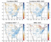
Figure 1. The correlation of snowfall with (top left) the NINO3 index, (bottom left) the NAO index and (top right) the standardized NINO3 minus standardized NAO (NINO-NAO) index and (bottom right) the regression of snowfall on the NINO-NAO index. All indices and the snowfall are for the winter (December to March) mean. Units for the regression are inches. -click here to enlarge
Conclusions
[11] In winters when an El Nino event and a negative NAO combine, analyses reveal that there are positive snow anomalies across the southern U.S. and northern Europe. In western North America and the southeast U.S. snow anomalies are associated with total precipitation anomalies and southward shifts in the storm track. In the eastern U.S., north of the Southeast, and in northwest Europe positive snow anomalies are associated with the cold temperature anomalies accompanying a negative NAO. The relations between large-scale climate indices and snow anomalies were used to attribute the snow anomalies for the 2009/10 winter with notable success in pattern and amplitude. We conclude that the anomalously high levels of snow in the mid‐Atlantic states of the U.S. and in northwest Europe this past winter were forced primarily by the negative NAO and to a lesser extent by the El Nino. The El Nino was predicted but, in the absence of a reliable seasonal timescale prediction of the NAO, the seasonal snow anomalies were not predicted. Until the NAO can be predicted (which may not be possible [Kushnir et al., 2006]), such snow anomalies as closed down Washington D.C. for a week will remain a seasonal surprise.
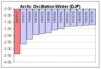
ICECAP Note: Recall we projected a negative AO/NAO due to low solar/east QBO favored stratospheric warming, a positive AMO and high latitude volcanoes (Redoubt and Sarychev). The AO was most negative since 1950.
Whereas it is not always possible, many years it is. Continued low solar and a positive AMO should bias the NAO to negative in upcoming winters. If Katla goes, watch out.
By Penny Starr, Senior Staff Writer
On Capitol Hill on July 22, 2010, Sen. John Kerry (D-Mass.) predicted there would be an “ice-free Arctic” in “5 or 10 years.” Speaking at a town hall-style meeting promoting climate change legislation on Thursday, Sen. John Kerry (D-Mass.) predicted there will be “an ice-free Arctic” in “five or 10 years.”
“The arctic ice is disappearing faster than was predicted,” Kerry said. “And instead of waiting until 2030 or whenever it was to have an ice-free Arctic, we’re going to have one in five or 10 years.”
However, the Web site of the National Oceanic and Atmospheric Administration says: “Using the observed 2007/2008 summer sea ice extents as a starting point, computer models predict that the Arctic could be nearly sea ice free in summertime within 30 years.”
NOAA cites as its source on Arctic sea ice a study published in the April 3, 2009 edition of Geophysical Research Letters by J.E. Overland and Muyin Wang. (Overland works for NOAA at the Pacific Marine Environmental Laboratory and Wang is at the Joint Institute for the Study of the Atmosphere and Ocean, University of Washington, in Seattle.)
In their study, Overland and Wang “predict an expected value for a nearly sea ice free Arctic in September by the year 2037.” They also note in their summary, however, that “a sea ice free Arctic in September may occur as early as the late 2020s” based on their analysis of six computer models.
Muyin Wang told CNSNews.com that she and her colleague analyzed the six models, which generated earlier and later estimates of an ice-free Arctic sea in summer months, and the median was the year 2037. The amount of ice in the Arctic sea fluctuates throughout the year - more in winter, less in summer - and Wang said there would always be ice in the Arctic sea during the winter months.
When asked about Kerry’s statement that the Arctic sea would be ice-free in five to 10 years, Wang said that time-range is an extreme case scenario.
“That’s the extreme case,” Wang said. “To me, that could be, but it’s less than a 50 percent chance.”
CNSNews.com called Sen. Kerry’s office on Thursday to ask for the source of the senator’s assertion that there will be “an ice-free Arctic” in five to ten years. The office directed CNSNews.com to contact Kerry press secretary Whitney Smith by email. Smith did not respond to repeated emails asking the source for Kerry’s assertion about the Arctic ice.
Kerry’s remarks came during the second of three panels at an event sponsored by Clean Energy Works, an environmentalist coalition that brought supporters of to Washington, D.C., to show what it called “broad support” for a “clean energy and climate bill.”
Along with Sen. Joe Lieberman of Connecticut, Kerry is the sponsor of the American Power Act, a bill that would cap carbon emissions in the United States in the interest of preventing climate change.
In his talk on Thursday, Kerry said environmental degradation is happening faster than previously anticipated.
“Every single area of the science, where predictions have been made, is coming back faster - worse than was predicted,” Kerry said. “The levels of carbon dioxide that are going into the ocean is higher. The acidity is higher. It’s damaging the ecosystem of the oceans.”
“You know, all of our marine crustaceans that depend on the formation of their shells— that acidity undoes that,” he said. “Coral reefs - the spawning grounds for fish. Run that one down and youll see the dangers.”
Kerry further said: “Predictions of sea level rise are now 3 to 6 feet. They’re higher than were originally going to be predicted over the course of this century because nothing’s happening. But the causes and effects are cumulative.”
“The Audubon Society not exactly, you know, an ideological entity on the right or the left or wherever in America - has reported that its members are reporting a hundred-mile swath in the United States of America where plants, shrubs, trees, flowers -things that used to grow—don’t grow any more,” Kerry said.
See more here. Be sure to read the comments section where the public has Kerry pegged as a ignorant fool or tool along the same lines as Al Gore and Prince Charles.
By Jane Van Ryan
Voters in ten states oppose higher taxes on America’s oil and natural gas industry by a 2-to-1 margin, according to a new poll released today.
The poll, conducted by Harris Interactive for API in ten states, found that 64 percent of registered voters oppose an increase, including 46 percent of voters who strongly oppose.
Only 27 percent support increasing taxes. The poll was conducted via telephone between July 15 and July 18 among 6,000 registered voters.
“Voters know raising taxes on an industry that provides most of their energy and supports more than 9.2 million jobs would hurt them and damage the economy,” said API President and CEO Jack Gerard. “Raising taxes doesn’t address their major concern, which is putting people back to work.”
Both the administration and some members of Congress have proposed imposing billions of dollars in new taxes on the oil and natural gas industry. But the poll found that those surveyed believe the two most important issues for the federal government to address are the economy and job creation. National polls from Gallup, CBS News and Bloomberg have reported similar results.
“With 15 million people out of work, now is not the time to be imposing more taxes,” Jack said. “The fact that the proposals are being pushed under the guise of addressing the oil spill in the Gulf doesn’t make them any better.”
The Energy Information Administration (EIA) says the U.S. oil and natural gas industry paid almost $100 billion in federal income taxes in 2008. As this video shows, the industry’s effective tax rate is much higher than the average for all other industries.
Harris Interactive conducted the polling in Colorado, Michigan, North Carolina, North Dakota, Pennsylvania, Virginia, Maine, Missouri, Ohio and West Virginia. The individual state polling results are available here.
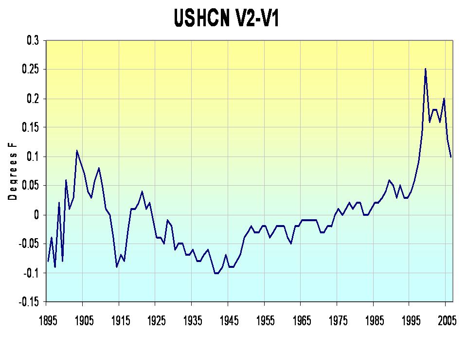
By Joseph D’Aleo
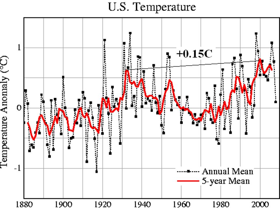
Recently we shared a story in the Wall Street Pit how NASA has gradually reduced the warm middle 20th century blip and created a more continuous warming. You can see in this 1976 National Geographic graph, a rather significant warm period starting in the 1920s and peaking during the dust bowl era in the United States in the 1930s and only slowly declining heading into the 1950s. It showed more significant cooling in the 1960s and 1970s. The story questioned where to from there.
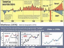
The story showed three Hansen plots of global temperatures from 1980, 1987 and 2007 (above, enlarged here). The 1960s started out 0.3C colder than the 1950s in 1980, dropped to 0.05C colder by 1987 and was actually warmer by 0.05C in 2007.
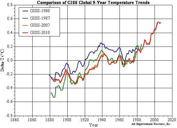
We have extracted the values from the graphs and superimposed them on the graph below (enlarged here). You can see the big 1980 to 1987 dropoff and subsequent further cooling by 2007 and 2010 (orange and red).

You can see how the picture from 1976 and 1980 changed rather dramatically in 1988 (with the record through 1987). That second graph was in time for the infamous Hansen congressional testimony where it was introduced with Tim Wirth’s (then senator and now President of the United Nation’s Foundation) orchestrated ceremony which was scheduled on what was forecast to be the hottest day of the week with air conditioning turned off and windows opened and fans blowing hot air to a perspiring Hansen and committee and media.

The result has been to cool off the early and middle part of the record to accentuate the apparent warming trend. The anomalies are also affected. The base period for NASA to compute averages is 1951 to 1980. They lowered the average by about 0.115C or 0.207F.
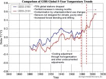
The data after 1990 (as shown above, enlarged here) has been in contrast adjusted up by station dropout (especially rural), tenfold increase in missing months both of which forced more infilling and estimation, contamination by land use changes and urbanization, use of sensors not designed for climate trend analysis. These were described in detail in Surface Temperature records: Policy Driven Deception? here.
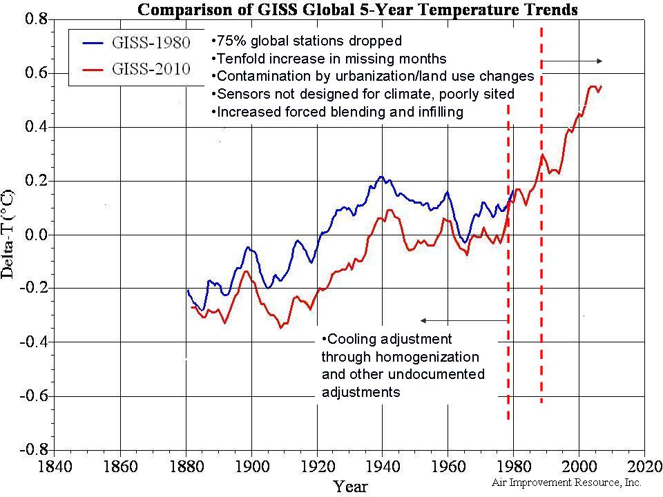
Hadley’s CRU has changed significantly just in the last decade in much the same way. The 1940 warm blip that worried Wigley and others was minimized which minimized the three decade cooling from 1940 to the late 1970s. The same issues mentioned above have exaggerated the recent warming below (enlarged here).
The cooling of the base period for CRU (1961 to 1990) was 0.092C (0.16F).
NOAA USHCN saw a change in 2007 that removed an urban adjustment and produced this annual change in US temperatures below (enlarged here). Again we see a cooling of the mid 20th century warm period and an elevation of recent years.

We are working on a GHCN global change analysis. Charts like this which are common across the globe (this from Alan Cheetham) tell us we will probably find the same (below, enlarged here).
Stay tuned. See PDF here.
By Oren Dorell, USA TODAY
March, April, May and June set records, making 2010 the warmest year worldwide since record-keeping began in 1880, the National Oceanic and Atmospheric Administration says. “It’s part of an overall trend,” says Jay Lawrimore, climate analysis chief at NOAA’s National Climatic Data Center. “Global temperatures ... have been rising for the last 100-plus years. Much of the increase is due to increases in greenhouse gases.”
There were exceptions: June was cooler than average across Scandinavia, southeastern China, and the northwestern USA, according to NOAA’s report.
If nothing changes, Lawrimore predicts:
Flooding rains like those in Nashville in May will be more common.
“The atmosphere is able to hold more water as it warms, and greater water content leads to greater downpours,” he says.
Heavy snow, like the record snows that crippled Baltimore and Washington last winter, is likely to increase because storms are moving north. Also, the Great Lakes aren’t freezing as early or as much. “As cold outbreaks occur, cold air goes over the Great Lakes, picks up moisture and dumps on the Northeast,” he says.
Droughts are likely to be more severe and heat waves more frequent.
More arctic ice will disappear, speeding up warming, as the Arctic Ocean warms “more than would happen if the sea ice were in place,” he says. Arctic sea ice was at a record low in June.
Marc Morano, a global-warming skeptic who edits the Climate Depot website, says the government “is playing the climate fear card by hyping predictions and cherry-picking data.”
Joe D’Aleo, a meteorologist who co-founded The Weather Channel, disagrees, too. He says oceans are entering a cooling cycle that will lower temperatures.
He says too many of the weather stations NOAA uses are in warmer urban areas.
“The only reliable data set right now is satellite,” D’Aleo says.
He says NASA satellite data shows the average temperature in June was 0.79 degrees higher than normal. NOAA says it was 1.22 degrees higher.
ICECAP NOTE: UAH RELEASE: Global composite temp.: +0.44 C (about 0.79 degrees Fahrenheit) above 20-year average for June. All temperature anomalies are based on a 20-year average (1979-1998) for the month reported.) Notes on data released July 7, 2010:
Global average temperatures through the first six months of 2010 continue to not set records, according to Dr. John Christy, professor of atmospheric science and director of the Earth System Science Center at The University of Alabama in Huntsville. June 2010 was the second warmest June in the 32-year satellite temperature record and the first six months of 2010 were also the second warmest on record.
Compared to seasonal norms, temperatures in the tropics and the Northern Hemisphere continued to fall from May through June as the El Nino Pacific Ocean warming event fades and indications of a La Nina Pacific Ocean cooling event increase. The warmest Junes on record were June 1998 at 0.56 C warmer than seasonal norms, June 2010 at +0.44 and June 2002 at +0.36.
Satellite lower troposphere temperatures and global station data has been diverging in recent decades. NOAA announced that for the globe June 2009 (for the globe) was the second warmest June in 130 years falling just short of 2005. In sharp contrast to this NASA, The University of Alabama Huntsville MSU satellite assessments had June as the 15th coldest and Remote Sensing Systems (RSS) 14th coldest in 31 years.
Here is a plot of the NOAA global versus the satellite global since 1979 (enlarged here).
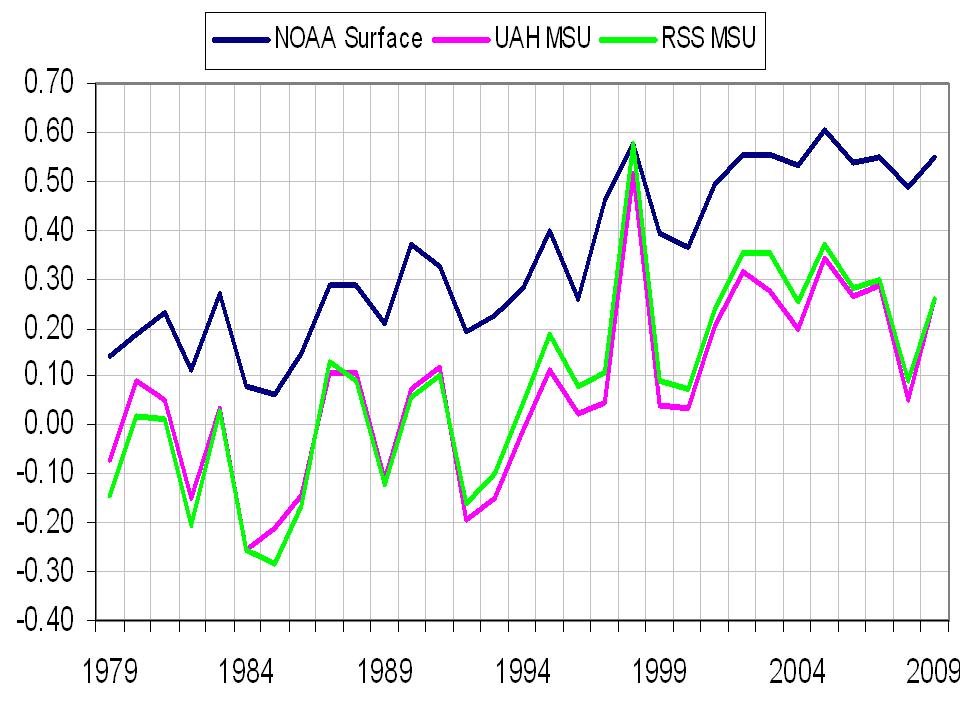
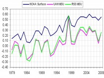
Climate models according to Ben Santer of Lawrence Livermore Labs modelling center predict the lower troposphere should warm (1.2X) more than the surface because that is where the greenhouse gases are. That would look like this (enlarged here).
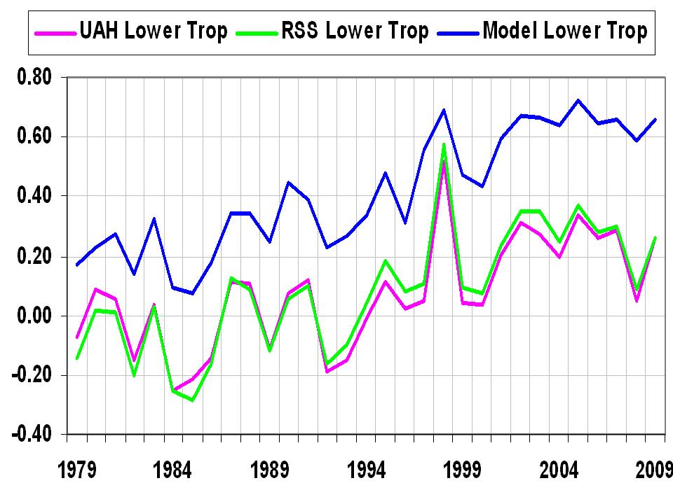
This implies that the greenhouse theory /models are in error and/or surface data is seriously compromised by other factors like land use and urbanization or more likely both. See more here.
Given the onset of La Nina and rapid cooling of the Pacific and some cooling in the eastern Atlantic due to upwelling (and soon the tropical and western Atlantic from heat extraction by tropical systems- western Gulf has already cooled from Alex and TD), oceans should continue to cool and like in 2007, temperatures globally should drop significantly. 2010 will likely fall in the top 5 but not be the warmest ever. The top 5 ranking is guaranteed by all the issues identified here. Reality is something else.
Comments from Richard Keen on the Lawrimore story: Lawrimore’s comment..."Heavy snow, like the record snows that crippled Baltimore and Washington last winter, is likely to increase because storms are moving north. Also, the Great Lakes aren’t freezing as early or as much. “As cold outbreaks occur, cold air goes over the Great Lakes, picks up moisture and dumps on the Northeast,” he says.” ...shows a complete lack of understanding of weather (which makes up climate). East coast snows are caused by lows off the coast, and if the storms move north, Baltimore, Philadelphia, NYC et al. find themselves in the warm sectors of the lows, and enjoy warm southerly winds and rain. Furthermore, during the snow storms, the winds are from the northeast bringing moisture from the Atlantic (hence the name “nor’easter” for these storms); very little of the moisture comes from the Great Lakes. One of Philadelphia’s snowiest winters was 1978-79, when the Lakes were all but frozen over. Along the east coast, a region that averages very near freezing during the winter, the limiting factor for snow storms is not moisture, but temperature. Most storms are rain.
Now, the spot check. NOAA’s calculation of the global temperature is based on their analysis of departures at 2000 or so grid points. One of those points included my weather station at Coal Creek Canyon, Colorado, a location with no UHI or other troublesome influences. The NOAA map of June anomalies for the US, based on an unknown selection of stations, has Coal Creek sitting on the +4F contour. The Coal Creek record is long enough to calculate 30-year normals, and June 2010 comes in at +1.0F above normal. That’s 3 degrees less than the NOAA estimate for the same location, which is the difference between June being in the top 3 or being in the middle third. Now, this is simply a spot check of one of NOAA’s 2000 grid points, but it leads to the question of how far off are the other grid points?
Cheers, Dr. Richard Keen
See also Marc Morano’s full text of his very detailed compilation of responses to NOAA’s Lawrimore on Climate Depot here.
By Andrew Bolt, Herald Sun
No wonder global warming prophets such as Al Gore, Greenpeace and Clive Hamilton dodge debates. Warming worrier Richard Littlemore of DeSmogBlog.com runs up the white flag after a radio debate with sceptic Christopher Monckton:
In hindsight, I played perfectly into the hands of Monckton and his happy radio host, Roy Green, who share the same goal - not to win an argument about global warming science, but merely to show that there still IS an argument. Of course there’s not. But while we danced angels around the head of a pin, I can imagine Green’s listeners thinking, “Oh my. This is very confusing. No wonder the government says it’s too early to take action.” Score one for Monckton....
It was also a tactical error to start pointing people to helpful websites with clear graphs and reliable science that could support my position. It left open the possibility for Monckton to say, “I could produce 35 graphs” to the contrary - which fiction then drifted to the listeners as if it were, well, accurate in the real world.
Thanks (and my apologies) to those of you who volunteered some much-preferable debating strategies. Maybe next time.
Hear the debate here. Or read it here.
UPDATE
I really don’t think Littlejohn was ever going to win after this opening salvo from Monckton:
Well let’s first of all begin on this question of funding, and let us talk about the funding for DeSmog Blog. Now DeSmog Blog was founded with $300,000 of money from a man called John Lefebvre who is an Internet gaming fraudster convicted last year of making hundreds of millions of dollars - a large chunk of which he is now being made to pay back to the government - by unlawfully laundering money to do with unlawful Internet gaming.
He is the person who got into bed with Mr. Littlemore’s boss at a PR [public relations] company, a Mr. James Hoggan (ICECAP NOTE: Chairman of the board of the radical David Suzuki Foundation and whose PR company promotes numerous alternaive energy companies), and they took up the DeSmog Blog, whose job of course is not to debate the science of climate, but to inaccurately misrepresent the alleged or supposed or imagined funding of anyone who dares to challenge the supposed consensus on the climate. So let’s get that thing clear first of all. DeSmog Blog was founded, is funded, and is run by a convicted and self-confessed crook, and furthermore that crook is now in the business of running a solar energy corporation and therefore has a direct vested interest in peddling the climate change scare.
I would start by making it clear that Mr. Littlemore is a public relations executive working for a convicted Internet fraudster.
And then Monckton got stuck into the evidence. Read on for sheer enjoyment.
But this trashing of global warmers in a debate has happened before, of course. Ask Michael Crichton.
See post here.
----------------
Lord Monckton Responds to Abraham Attack About Global Warming Science- Press Release
By Bob Ferguson, SPPI
Christopher Monckton has issued an extensive and detailed critique and refutation of a widely-circulated 83-minute personal attack on him by one J.P. Abraham, a lecturer in fluid mechanics at the University of St. Thomas, Minnesota.
Professor Abraham’s 83-minute lecture with 115 slides purported to demolish a talk about climate change that Lord Monckton had given in St. Paul, Minnesota, in October 2009. More than 2.5 million people have seen Moncktons talk on YouTube, making it one of the most popular viewings on the web.
In June 2010, Abraham posted up an attack on the internet via the servers of the University of St. Thomas. Within a week, Monckton’s 84-page letter with its near-500 questions was in the Abraham’s hands, to which he has not responded as challenged.
Monckton publicly accuses Abraham of -
· Bad faith in having “furtively” spent eight months preparing his savage personal attack behind Monckton’s back, entirely contrary to accepted academic practice;
· Malice in having made dozens of serious allegations about Monckton when he knew the allegations he had made were false in every material particular, or had no reason to believe the allegations were true;
· Appealing to a false authority on the subject of the climate that, as a lecturer in fluid mechanics, he did not possess (Monckton demonstrates Abraham appears at times competent even in arithmetic);
· Academic dishonesty in having repeatedly made up statements that Monckton had not made, having put those statements to other scientists, having obtained hostile responses from those scientists, and having included those hostile responses in his attack as though they were responses to what Monckton had said; and
· Lying repeatedly by misstating what Monckton had said and then attacking those misstatements; by falsely and repeatedly alleging that Monckton had misrepresented scientists results when Monckton had either accurately represented the results or not cited the scientists he was alleged to have misrepresented at all; by unjustifiably and repeatedly impugning Monckton’s integrity, qualifications, experience, and competence in a manner that he knew to be inaccurate; and by repeatedly taking Monckton’s words out of their context and making a wilful nonsense of them.
Monckton backs up his rebuttal with a wealth of detail.
The University of St. Thomas has refused a request by Monckton that it should take down the Abrahams talk from its servers and has also refused to comply with its duty to investigate Monckton’s complaint about shoddy academic misconduct. Abraham and the University are half-heartedly attempting to characterize the issue as a mere “academic dispute”.
Lord Monckton serves as policy adviser and contributing author to the Science and Public Policy Institute, which has as a courtesy to him and interested readers made his response to Professor Abraham available on its main website. Contact - Robert Ferguson